Your Custom Text Here
E-Commerce at Boingo
The Story so Far…
I have been at Boingo for about six months. My primary goal at Boingo is to infuse design into the product development process and thereby, build an in-house design studio.
To achieve this, my primary objective for the first 180 days was to deliver design solution to an existing business vertical and demonstrate that there is –
Direct correlation between UX and ROI
Demonstrate the value of long term customer retention
Over time, build affinity for the Boingo brand
The Process
In order to deliver results, the first thing I did was establish the process. This was done to remove subjectivity from the design process as well at to manage expectations for all of the stakeholders throughout the entire process.

The idea is to use this process as a framework and adapt it to projects as needed.
The end goal of this process is to generate concepts and validate them with the users on an ongoing basis. This continuous cycle of co-creating (with the user) is used to inform current and future iteration of the product.
The Project
To put this process into action, we chose the Boingo’s B2C e-commerce experience, since this directly impacts the revenue. Solving for this meant solidifying UX’s role within the broader organization.
Putting the Plan to Action - Starting with Formative Research
In this phase, we undertook the following activities –
Data analysis. This helped us uncover the following macro-trends –
Overall conversion rate, from start to finish.
Page by page breakdown of conversion rate.
Time it took to complete the task, broken down by platform and devices.
Qualitative Usability Testing. We conducted six rounds of usability testing. This helped us understand user’s emotional journey. Some of the key findings from this study were as following –
Users couldn’t discern that one the items was preselected.
Certain badges as well as certain blurbs of text were hurting the experience as they were adding to the cognitive load and complicating the decision making process.
One of the add-on was well received. While the other ones caused confusion and frustrated the user.
Some of the specifics of this data isn’t being shared since it is confidential to the organization.
The Goal
We synthesized the qualitative and quantitative data and used it to define our goal -
Design a simplified and elegant e-commerce experience so that the conversion rate for mobile is at par with the desktop experience for the short term.
For the longer term, the goal was to increase the conversation rate for both mobile and desktop experience by a substantial percent.

Existing Flow
The Roadmap
To get to the goal we created two buckets –
Optimize - This included realigning existing elements, introducing small changes that would require no more than two development sprints. Most of the items in this category were not very resource exhaustive.
Enhance - This included radical changes to the flow. The projects in this category would require substantial investment from both, front-end and back-end teams.
The goal for the next 3-4 months was to focus on items within the optimization category by undertaking the following activities –
Generating concepts
Rapid prototyping
Iterative testing
Followed by live A/B testing
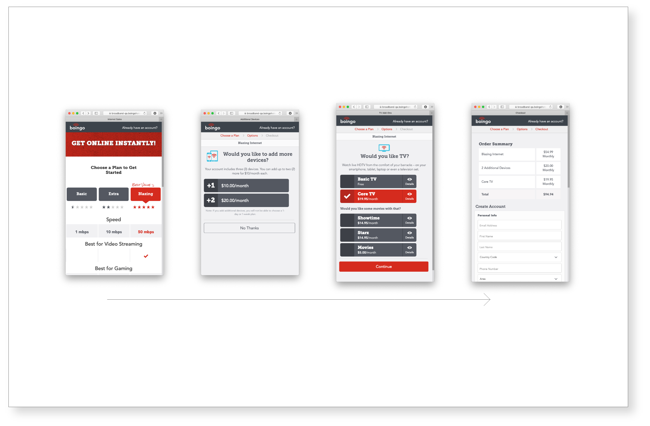
Project 1 - Optimizing the Product Page
Hypothesis - The product page wasn’t optimized for an efficient experience. None of the elements (text, layout, badges, CTA) were tested and validated by users.
Starting with Sketches

Early Concepts

Process - We undertook multiple rounds of usability testing, each one informing the next round. We proposed a few final design layout for the broader team to consider. Some of the key enhancements that we made were as following –
Putting key data sets like plan name, plan specifications and price within a single visual unit.
Removing copy that was more or less ignored by the users.
Reducing the length of the page (by realigning content and by revisiting the visual design system).
Exploring a design option where the Selection CTA is above the fold.
Iterative Testing


Outcome - The final two designs were live tested (Control vs. A vs. B). This initial round of quantitative testing helped us zero down on the version of design that would work for our target audience.
With these adjustments, we were able to increased our conversion rate by about 50% on the mobile device. This surpassed our initial goal (of bringing the mobile conversion rate at par with the desktop experience).
However, this is by no means an end. The idea is to continue running these live A/B tests, tweaking the design and exploring new concepts.
Enhancements & The Next Steps…

Prototype

As the experience is getting optimized, there are some more radical concepts that are being built and tested. This includes the following –
Allowing the users to choose duration of coverage upfront. This was an unmet need that was uncovered during user interviews.
Reducing the add-on page to a modal. Since fewer pages meant a higher conversion rate.
Providing links to modify the shopping cart experience. This is an industry wide best practice.
These initial prototypes have already been tested at a qualitative level and tweaked based on user’s feedback. The next few months, we plan on exciting on these in similar fashion (multiple live A/B tests) and add to the overall conversion rate.
And if you are still reading this, thanks! 😊